List of contents
Introduction

To establish an effective workflow for your team, it’s important to understand the difference between low-fidelity wireframes and high-fidelity prototypes.
What is wireframing?
The term wireframe predates its current use in digital design. Web and app designers borrowed the term from the world of CAD (computer-aided design) and CGI animation. And they, in turn, borrowed it from earlier fields of car modelling, stop-motion animation, and sculpture.
In fact, most people are first exposed to wireframing when they’re children in primary school, and use chicken-wire to build frames for their papier-mâché puppets, masks and dinosaurs!In each of these cases, a wireframe serves the same purpose: to act as a rough approximation of the final product before the addition of final elements like surfaces, skins, colours, textures, lighting, etc.
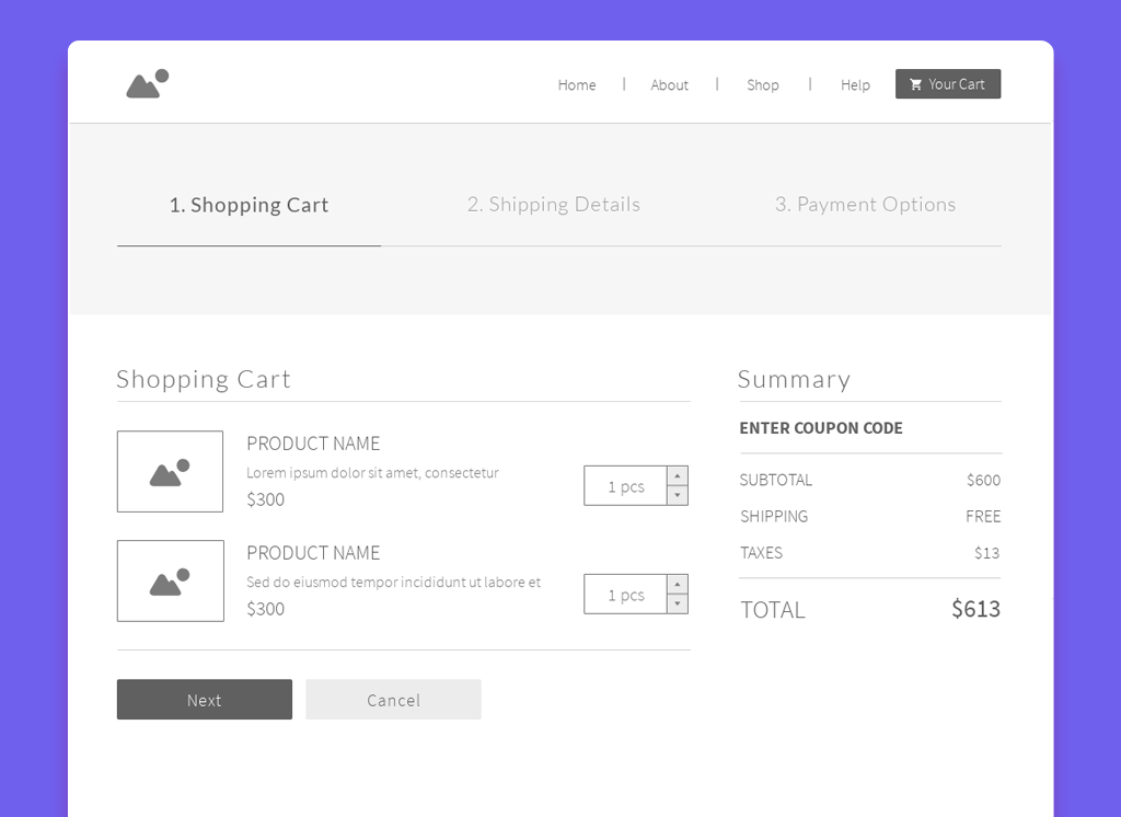
Think of a wireframe as the blueprint for a final design. It makes sense to experiment with this kind of skeleton – early in the design process – before a lot of time and money has been invested in a polished product, or the final coding begins.To get a sense of what wireframing looks like in web design, here’s a wireframe of a shopping cart, taken from our e-Commerce Website template bundle. You can see that most of the important elements of the page are already in place. However, instead of full-color, branded graphics, and descriptive content, the wireframe uses generic placeholders:
What is fidelity?
Prototypes don’t necessarily look like final products — they can have different fidelity. The fidelity of a prototype refers to how it conveys the look-and-feel of the final product (basically, its level of detail and realism). Fidelity can vary in the areas of:
- Visual design
- Content
- Interactivity
What are low-fidelity wireframes?
Low-fi wireframes act as the initial blueprints for web pages and app screens – a rough approximation of the final product. They’re especially useful in the early stages of product development because they put the focus on pure functionality, not aesthetics.
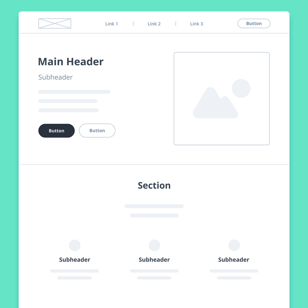
Accordingly, they’re rendered in a monochrome palette – deliberately excluding specific details like colours, fonts, logos, and exact sizing. Instead, low-fidelity wireframes use image placeholders and basic shapes to indicate what elements will ultimately populate a page. Generic ‘lorem ipsum’ text or ‘redacted’ fonts stand in for future content and copy. Here’s one of our low-fidelity wireframe templates to give you a sense of what all this looks like in practice:
What are high fidelity wireframes?
High-fi wireframes are thrilling because they mimic the look and feel of an app or website – before it’s actually developed. They normally include all the branding, copy, colors, logos, fonts, and graphics that will be part of the final product.
Hi-fi wireframes are most useful at the tail end of the design process, after initial user-research is complete, and underlying decisions about both layout and content have been made.
Wireframes with hi-fi elements, but no interactivity, are often called mockups. A mockup becomes a high-fidelity prototype once interactions, transitions, or animations are added. With clickable menus and buttons, hi-fi prototypes provide a visceral sense of the user experience. This allows teams to tweak usability before final design approvals, testing, and hand-off to the developers.
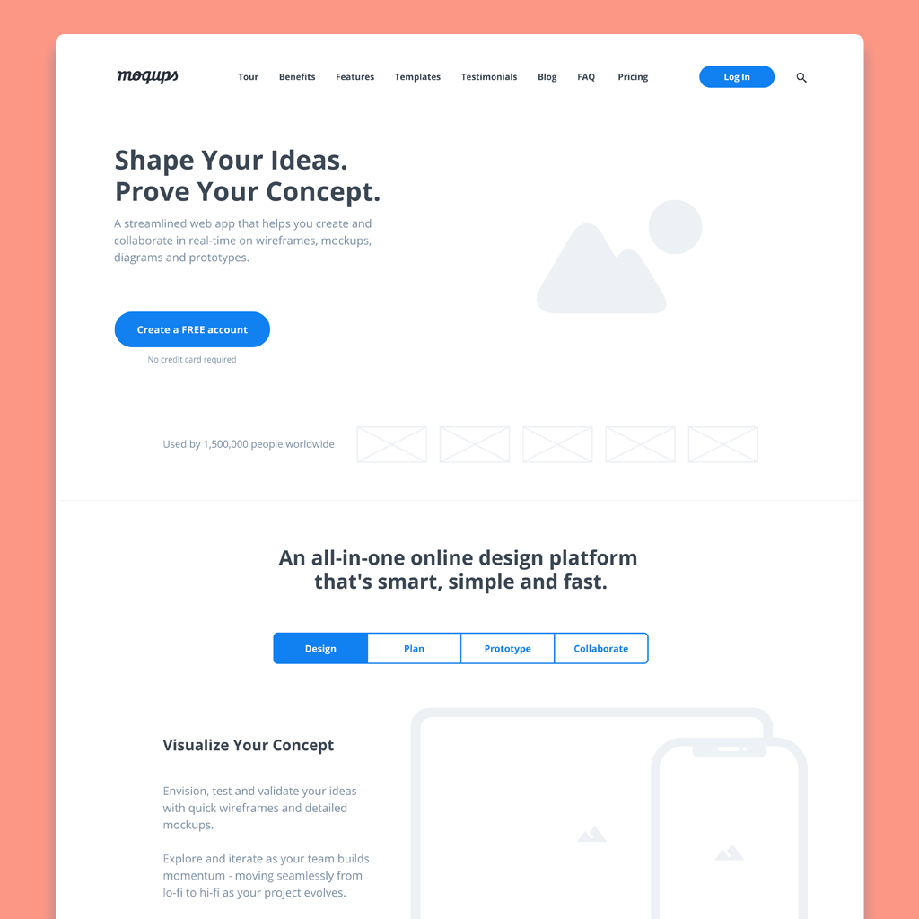
If you have your hi-fi content ready to go, here’s a high-fidelity wireframe template that you can quickly customize. Just swap in your copy, images, graphics, branding, and colors:
Pros and Cons
Pros and Cons of Lofi
| Pros | Cons |
|---|---|
| Quick to build, easy to iterate | Less inspiring than hi-fi |
| Focuses on function not aesthetics | Lacks full interactivity |
| Establishes consensus early on | Inadequate for unmoderated testing |
| Works out flow before costly content | Unsuited for investor pitch |
Pros and Cons of Hifi
| Pros | Cons |
|---|---|
| Offers look and feel of final product | Needs a longer timeline |
| Clickable and interactive | Requires graphics and content |
| More accurate for user testing | Iteration takes time and effort |
| Delivers design requirements for dev | Polished work discourages feedback |